Published: Aug 24, 2024
Let’s build iOS 18’s navigation title card in SwiftUI
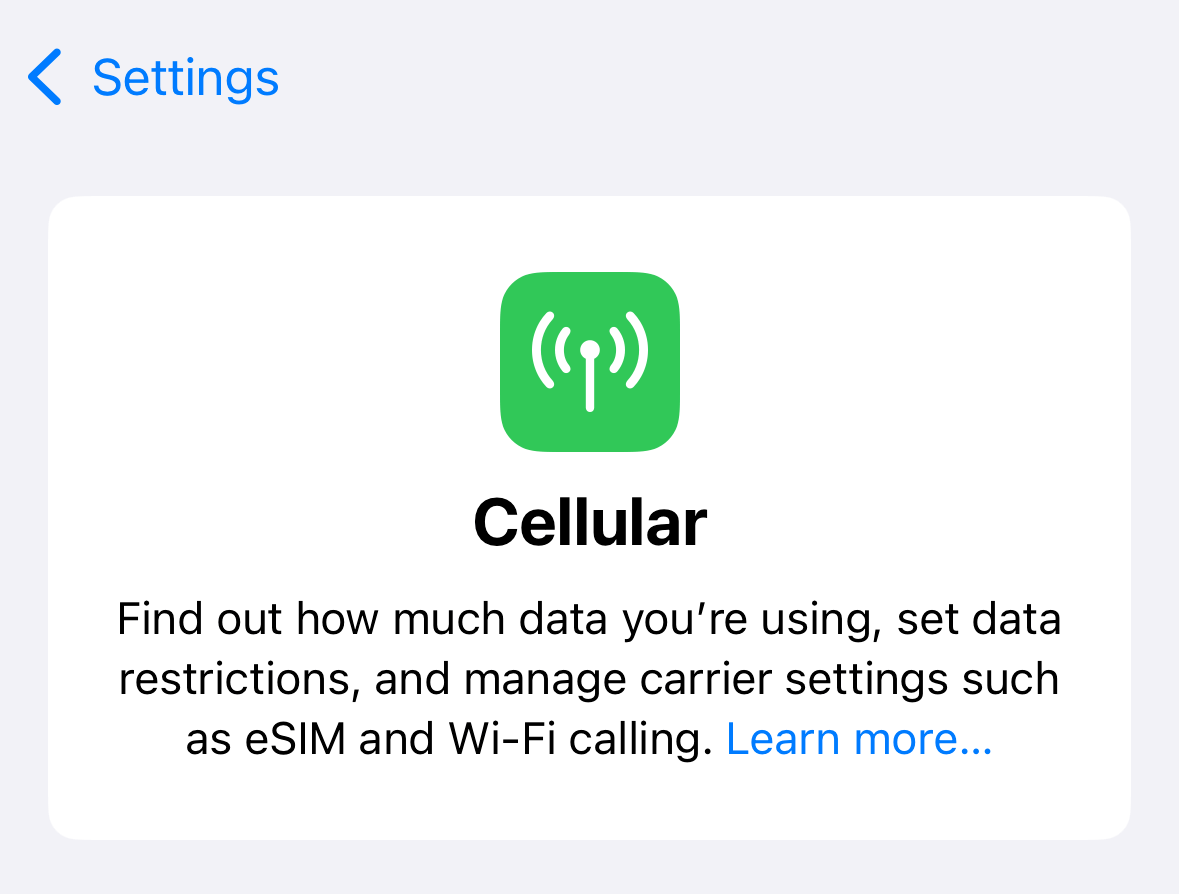
iOS 18 standardizes a design pattern that could be called “navigation title cards”, for lack of an established HIG term. In their simplest form, these cards appear at the top of a list of content and provide brief explanatory text.

This card replaces the “large navigation title” label when scrolled to the top. As the card’s title scrolls behind the navigation bar, the inline title fades into view. This is a small, but important detail, because it reduces unnecessary replication of information while reinforcing the relationship between the card’s title and the page’s title.
Let’s see how we might build this in SwiftUI.
#
Building the card
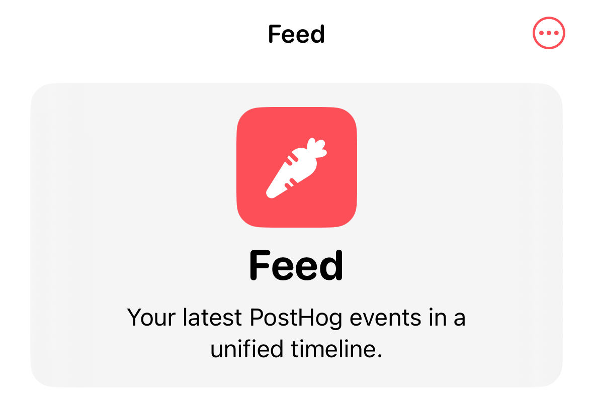
The card itself is fairly simple, being composed of a vertical stack of an image, a title, and some descriptive text.
There’s a few ways to dial this design in; for the purpose of this article we’ll design a card that’s meant to work in a plain List context.
VStack(spacing: 8) {
  Image(systemName: "carrot.fill")
    .foregroundStyle(.white)
    .font(.largeTitle)
    .bold()
    .padding()
    .background(.accent)
    .clipShape(RoundedRectangle(cornerRadius: 16))
  Text("Feed")
    .font(.title)
    .bold()
    .fontDesign(.rounded)
  Text("Your latest PostHog events in a unified timeline.")
    .font(.callout)
}
.multilineTextAlignment(.center)
.frame(maxWidth: .infinity)
.padding()
.background(.ultraThinMaterial)
.clipShape(RoundedRectangle(cornerRadius: 16))

#
Fading the inline title label
Notice that the title “Feed” appears twice in the previous screenshot. To make the title label react to scrolling, we need to accomplish three related tasks:
We need to know when the card’s title has scrolled behind the navigation bar.
To know that, we need to know how large the navigation bar is, how large the card’s title label is, and where the card’s title label is in relation to the navigation bar.
Based on the above, we need to be able to change the opacity of the inline navigation title as the scroll view scrolls.
Note: iOS 18’s new onScrollVisibilityChange(threshold:_:) seems like it should do the trick, but as of iOS 18 Beta 6 I was not able to get this API to reliably fire when content scrolled on and off screen. Additionally, this API only provides a boolean trigger, limiting our ability to drive the title’s opacity in direct relation to the scroll position.
#
Changing the opacity of the inline navigation title
In SwiftUI, it’s not possible to directly change the opacity of the inline navigation title when using navigationTitle(_:). I’ve seen many recommendations on Stack Overflow to use UIAppearance for this purpose, but this is a brittle approach that can have over-reaching effects on your app’s navigation bars if you’re not careful.
Instead, we’ll provide a custom title label and a state property that allows us to change its opacity programmatically:
@State private var inlineTitleOpacity: Double = 0

var body: some View {
  ...
  .toolbar {
    ToolbarItem(placement: .principal) {
      Text("Feed")
        .font(.body)
        .bold()
        .fontDesign(.rounded)
        .dynamicTypeSize(.large ... .xxxLarge)
        .opacity(inlineTitleOpacity)
    }
  }
}
#
Determining the top content inset
Now that we can change the inline title label’s opacity, we need to calculate that opacity using the position of our navigation card’s title in relation to the navigation bar, i.e. the top content inset.
We’ll use a new iOS 18 API onScrollGeometryChange(for:of:action:). This API allows us to fire an event any time some aspect of our scroll view geometry changes. In this case we care only about the top content inset.
@State private var scrollTopEdgeInset: Double = 0

var body: some View {
  ...
  .onScrollGeometryChange(for: Double.self, of: { geometry in
    geometry.contentInsets.top
  }, action: { oldValue, newValue in
    scrollTopEdgeInset = newValue
  })
}
We now have all of the information needed to calculate our inlineTitleOpacity property.
#
Calculating the inline title opacity
To complete our puzzle we’ll use an API introduced in iOS 16: onGeometryChange(for:of:action:). This method fires an event any time a computed value changes, making it an efficient way to make scroll offset-driven effects like the one we want to build.
Text("Feed")
  .font(.title)
  .bold()
  .fontDesign(.rounded)
  .onGeometryChange(for: Double.self) { proxy in
    let frame = proxy.frame(in: .scrollView)
    return min(1, max(0, (scrollTopEdgeInset - frame.minY) / frame.height))
  } action: { inlineTitleOpacity in
    self.inlineTitleOpacity = inlineTitleOpacity
  }
And that’s it! Here’s the full solution for reference:
struct FeedView: View {
  @State private var inlineTitleOpacity: Double = 0
  @State private var scrollTopEdgeInset: Double = 0

  var body: some View {
    List {
      Section {
        VStack(spacing: 8) {
          Image(systemName: "carrot.fill")
            .foregroundStyle(.white)
            .font(.largeTitle)
            .bold()
            .padding()
            .background(.accent)
            .clipShape(RoundedRectangle(cornerRadius: 16))
          Text("Feed")
            .font(.title)
            .bold()
            .fontDesign(.rounded)
            .onGeometryChange(for: Double.self) { proxy in
              let frame = proxy.frame(in: .scrollView)
              return min(1, max(0, (scrollTopEdgeInset - frame.minY) / frame.height))
            } action: { inlineTitleOpacity in
              self.inlineTitleOpacity = inlineTitleOpacity
            }
          Text("Your latest PostHog events in a unified timeline.")
            .font(.callout)
        }
        .multilineTextAlignment(.center)
        .frame(maxWidth: .infinity)
        .padding()
        .background(.ultraThinMaterial)
        .clipShape(RoundedRectangle(cornerRadius: 16))
      }
      .listSectionSeparator(.hidden)

      Text("Cell 1")
      Text("Cell 2")
      Text("Cell 3")
    }
    .onScrollGeometryChange(for: Double.self, of: { geometry in
      geometry.contentInsets.top
    }, action: { oldValue, newValue in
      scrollTopEdgeInset = newValue
    })
    .toolbar {
      ToolbarItem(placement: .principal) {
        Text("Feed")
          .font(.body)
          .bold()
          .fontDesign(.rounded)
          .dynamicTypeSize(.large ... .xxxLarge)
          .opacity(inlineTitleOpacity)
      }
    }
    .listStyle(.plain)
    .navigationBarTitleDisplayMode(.inline)
  }
}